Johannes Itten, painter, designer and teacher in the Bauhaus school, he´s the first to make a theory about the possible types of contrasts that are produced by the different features of color. Johannes distinguished seven types of contrast. saturation, temperature, simultaneous, proportion, luminosity, hue and complementary colors.
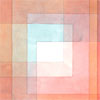
This table of colors we can see how much the visual sensation changes on the small colored squares according to the background color on which they are placed:

The 7 color contrasts identified by Johannes are:
1- The contrast of pure colors. Contrast of saturation.
100% of color saturation produces a high visual contrast. These colors do not contain any other colors, neither black nor white.

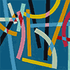
2- Color contrast between warm and cold colors. Temperature contrast.
The difference of temperature that the color has, increases the visual contrast between the two colors.

3- Simultaneous contrast.
When we have a saturated color (without any gray or white) and we place it above a gray, inside the gray tone we will sea the complementary color of the saturated color. If we have a red on a gray, some blue hue will be generated inside the gray color (blue is the complementary of the red). Simultaneous means that the contrast is generated because a color is near another color, and there is always an visual effect between them.

4- The contrast of proportion.
We have two colors but each color occupies a different area, or size. This difference generates a quantity contrast.

5- The contrast of light and dark.
Juxtaposition of two colors with different brightness or tonal value.

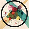
6- Contrast of complementary colors.
It is the contrast that create two opposite colors on the color wheel, that is the complementary colors.

7- Contraste of quality or hue
The quality or hue of the color, if it is more or less saturated, this will make the color more live or turned off. When we are placing a bright color near one without hue, a visual contrast is generated.