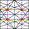
The Rule of Thirds consists in dividing the image with two horizontal guides and two vertical guides that generate a division into 9 equal parts. This is a technique of composition that we can use to fit our drawings and forms, order our composition and also it’s useful to improve our photos.
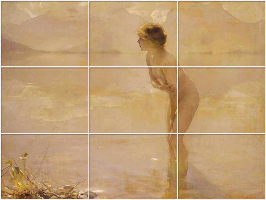
Painting by Paul Chabas, “Morning on septembre”, painted on 1912. Oil on canvas at the Metropolitan Museum of Art in New York. See in Wikipedia.
The female figure, the protagonist in this painting, is located on the right vertical line.
The advice provided by this Rule of Thirds is that if we divide our image with these lines and place our points of interest just into the position of one of these horizontal and vertical guides, the balance of the composition will be more harmonious and well tolerated. The points of interest will be better and stronger while getting the balance in the composition.
The key of this rule are the spatial proportions that are generated, because if an element takes a third, it leaves a free space of two thirds, so it gives direction to the look.
If we are interested in maintaining the visual balance in our image, it will be good to follow this rule, because the mind becomes more calm when things are distributed with this spatial relationship. On the other hand, if we want to create a little tension in the image, it’ss as easy as to set the points of interest outside of these guides, so that the look will not know very well where to escape.
As it’s better to see visual examples, here I present some works where I have added the vertical and horizontal guides.
We start with some landscapes with horizontal format:
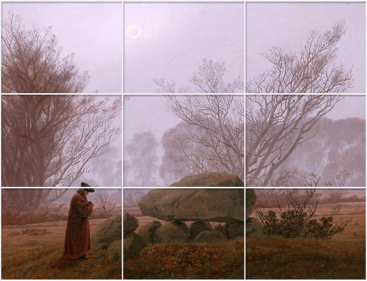
A walk in the evening, by Caspar David Friedrich, done on 1830, oil with 3.7cm x 33.3 cm. Source: Getty.edu
This painting, in addition of the excellent illumination, worthy of its author, is a good example: Friedrich places the moon and the man very close to the first vertical guide. And the great rock, which is one of those ancient Neolithic tombs, is marking the lower horizontal guide.
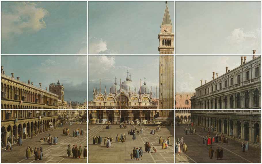
Landscape of Venice by Canaletto, painted between 1730 and 1734, measures 118.8cm x 76.2cm. Source: Harvard Art Museums . And here inside Google Art Project.
In this urban landscape of Canaletto, the great tower is exactly in the vertical line of the right. The same tower, with its windows, seems to be looking towards the small characters who walk through the square.
And now, un exemple of vertical format:
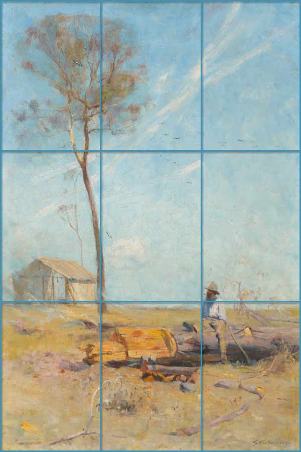
The cabin of the coach, painting by Arthur Streeton, from 1890 and with 51 x 76 cm. National Gallery of Australia. See inside Google Art Project
In this painting the tree touches the first vertical line in the Rule of Thirds. The cabin is located in the left side but above the horizon line, and the protagonist of the painting is exactly at the cross of the two guides at the lower right angle. A good example of distribution following the rule of thirds with a vertical format.
And finally, a portrait where the protagonist or point of attention is a woman::
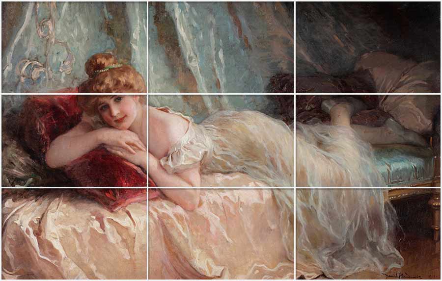
The lazy, Daniel Hernández Morillo. From 1906, Museum of Art of Lima. See into Google Art Project.
This one is an example of portrait, with the face very close to the cross between the first two lines of above and the left side. And in addition, with these proportions, the composition generates the direction of the look towards the rest of the body, what sets the whole most interesting. We look at his face, but later we look at his body. Very intelligent!
In short, the rule of thirds can work to create some of our compositions or when we want to fit the main figure or main element of the painting and we want it to have its own space and rhythm.
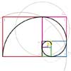
This is a guide but not the only one. For example The golden ratio is another way. This generates a division or proportion of 2 + 1.6, as I explained in the topic: The golden ratio
The golden ratio, The spiral structure is like a multiplication with so much energy, and it serves to create compositions very dynamic.
The rule of thirds is ideal for landscapes where we want to create harmony and stability, adding interesting points of interest that will be better highlighted. And it is also very useful for creating addresses and allowing space for those generated addresses.
After all, looking at a picture is a game for the viewer’s look, who is moving his eyes from one point to another of the picture, and this gives it life and meaning.
Often this rule is applied unconsciously. And many times this rule is not respected at all because the expressive freedom of the artist is above all rule.