
The color in a picture is always relative , you will never see a color as it really is, as how it is physically. This is because there are influences of te other colors around. These influences or interactions can be received in different ways. Below I have created a list of influential factors that makes the colors to be as relative and that generates such a variety of color results.
To better explain the various factors, I have added a photo Gif that changes to show the effect.
-
The colors in the memory. Remember the color.
To remember the exact color will be difficult if we have a similar range of colors to choose.
Example:

-
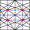
The context.
The colors and the shapes that are around. The same color with different shapes and with other colors around will be perceived with different value.
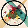
Kandinsky said: “What counts is not what, but how.”Kandinsky´s example:

-
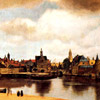
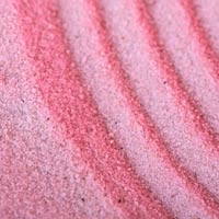
Flat colors against colors with textures, gradients, variations of thickness, shapes of the strokes, etc…
These graphic elements add an extra expressiveness that influences our perception of color.
Example of a color with a textured brushstroke:

-
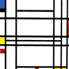
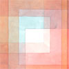
The relativity of color.
Color is the most relative of all media or visual art elements.
Example of one color surrounded by other colors:

-
Light intensity or brightness.
Lighter and / or darker colors.
Example of the same color surrounded by a darker or lighter background:

-
One color looks like two different colors. This is because the addition of colors.
Example of a color that looks like two colors:

-
Two colors look like the the same color. Abduction of colors.
Example of two colors that look like the same:

-
The simultaneous contrast.
The reason why the colors deceive is because the called “persistent image” or “simultaneous contrast”.
When we look at a colored circle for a few seconds and then we look to a blank area, a certain color appears in this white area, with the shape of the circle and with the complementary color that we have previously seen, and then it disappears in a few moments.
This visual phenomenon is called “image persistence” or “simultaneous contrast”.
It´s because of this phenomenon that when the humans move their view, we join and we influence the colors in a set.

-
The illusion of transparency.
It is the effect between colors that simulate a transparency, by the change of tones to each other.
2 Examples:


-
Factual mixtures with addition and subtraction.
2 types of physical mixtures:
a) direct mixing of projected light.
b) mixing indirectly of reflected light. -
The optical mixture. The persistence of the revised image.
It is the effect produced by a background with a different color under the same drawing or design, by the fusion of colors.
Example of Bezold effect:

———- ———- ———- ———-
Other aspects to consider
These are some factors that also influence the perception of color. They are broad topics that I only add to the list, but they would deserve a whole subject, being an advanced look at the analysis of the colors we have seen:
-
The juxtaposition of colors. The harmony and the amount of color.
-
Laminar color and volume color. Two natural effects
Laminar colors are the colors reflected on surfaces with a flat color, that being surrounded by this color, the material is somewhat dyed by this color.
The volume color can be seen in three-dimensional fluids or liquids, also by the effect of the lights. -
Weber-Fechner law. The measure in the mixture.
The visual perception of an arithmetic progression is dependent on a physical geometric progression.
-
Temperature of the colors.
-
Humidity of the color.
-
The limits of the colors.
-
Light intensity and faded limits.

I would like to use your discussion here to supplement my college art class on color intensity and simultaneous contrast. May I?
Thank you in advance
Yes!