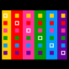
In our visual alphabet, we’ll add another element. The negative and positive space, dealing with space and the ability to perceive the shapes within a space.
In the world of photography negative and positive concept is also used, but is not the same, and this has created a lot of confusion …
In photography white become black and black becomes white …
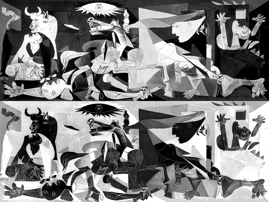
When we turn the image inside out, there are not white citizens in Guernica who are being bombed. In it´s mirror image, they are black!
That is, the visual element positive – negative is also distributed by the Picasso painting in both images, just in reverse. However, the box is still in excellent working both versions of the positive visual element – negative. Isn’t true that we still can see a horse, a woman, a lamp? The forms remain the same, we just changed the light. So, we can talk about the positive and negative version of this image, with the photographic concept of positive-negative.
But the visual element positive – negative is not the same thing than turn the image inside out with photoshop or any other program for images. We can´t say that the white is the negative (being empty) and the positive is the black (because we have more visual weight).
I repeat … it´s not like this. But do not worry … you can understand very well thanks to the concept of “form” and “space”, as now you are going to see.
What is the Positive Space?
The positive space is the shape, the object, the personage, and so on … that we identify inside the image. This is why it´s positive, because we can say Yes, there is!
What is the Negative Space?
It´s the space that we have between the shapes or figures. It can be termed as empty, non-existence. We say, NO, there is no shape or form. The pure negative space are the planes background or with just a colour. But beware! Sometimes it is very small, because inside the image, we can find many huddled forms. And the space around it will be the same whether is black, white, red, weathered … or other endless possibilities, and it shall continue to occupy the same space.
However, it is thanks to that empty space that we find the existence of the forms, which occupy the positive space.
I repeat. This negative space can be white, as happens during the day, or black, because it´s a night scene with black backgrounds. If there is nothing, no recognizable shape by human psychology, it´s a negative space.
Then, it happens that there are images where the human psychology can perceived two different shapes. This is because we can identify the positive and negative reversed. Thouse images are inside the concept called “figure-ground perception.”
In this picture you can see two types of forms, the blacks as men with their arms and hands, and on white, kind of bug or butterfly.
That is why the visual element “negative space – positive space” it differs from the visuals elements of “contrast”, “proportion”, “color” and “tone”. It is another concept that plays a different role within the image and composition. It helps us to identify the shapes and the ideas.
Artists with a lot of control of the positive – negative space
M. C. Escher
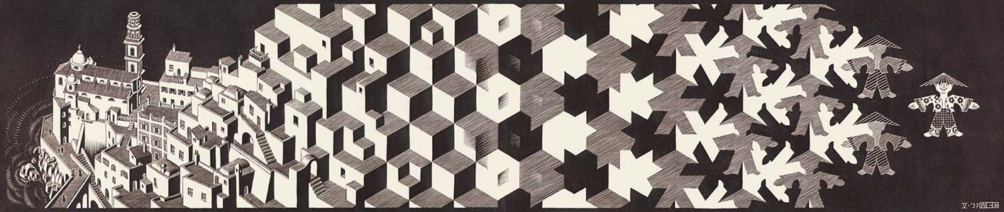
Metamorphosis, by Escher. The shapes of the houses are transformed into three-dimensional cubes until we see the figure of a man. It´s a spectacular game of shapes and spaces, because his works, in black and white colors, they allow him you to make these visual effects.
Web site of the artist: www.mcescher.com
Man Ray and Picasso
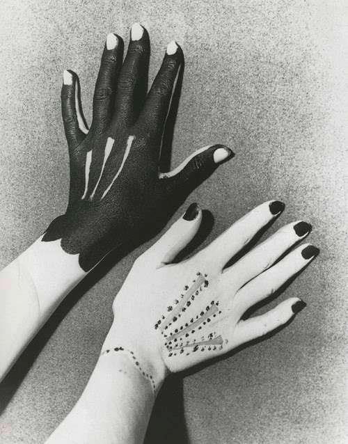
Man Ray worked with the photography and was a master of the image´s games. Is this picture we can see two hands, on the positive space, although one is black and the other white. The space around both hands is the negative. The hands were painted by Picasso in 1935, also a master of positive – negative space concept, as we have seen in Guernica.
Zheng Jiazhen
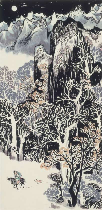
An example of Japanese painting, where the concept has always been worked. Zheng Jiazhen painted this painting titled “Coming home in the dark,” 1979. Hong Kong Museum of Art. See the picture on Google Art project.
We can see that the trunks of the trees are white, to paint the interior of the black forest and thus give us the feeling of night and danger. However, the foreground trees and the farthest are defined with black. The black sky, night and some black mountains in the middle – background space, to define forms. It’s not easy to do this type of work, but playing with the contrasting tones, the whites and blacks tones, he´s able to create positive shapes, so we can see the landscape.
In Japan, there is a word: Ma. It talks about the empty space. You can see this in Wikipedia .
M. Libert
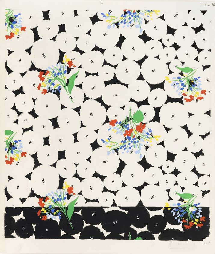
M.Libert | Cooper-Hewitt, National Design Museum. 1920–40. Pencil and gouache, white vellum paper. Rights: Gift of Max Wilner. Source: Cooper Hewitt collection
In this design of M. Libert, she sapes below are still perceived as round, although the illumination has been changed, making a liquid effect . In the top of this image, the background is black but the bottom of this image is white, but still it´s a a negative space, a empty background.